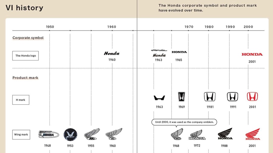
The new logo, described by Honda as representing "two outstretched hands," presents a thinner and more minimalist version of the current H, sans the trapezoid border.
Interestingly, this new logo bears a striking resemblance to Honda's original emblem from 1963. The first H logo featured a similarly slender, top-heavy design, although it was wider rather than taller. This logo made a brief appearance in the United States on the 1969 N600, Honda's inaugural car, before undergoing a redesign in 1969.
Honda has big plans for its new logo, intending to debut it on the upcoming 0 Series electric cars. The 0 Series represents a lineup of next-generation, ground-up-designed EVs set to hit the American market in 2026. These vehicles will also come with their unique branding.
Among the first 0 Series concepts are the Saloon and the Space-Hub, a sedan and a van with futuristic wedge-shaped exteriors. Honda has confirmed that the Saloon concept will serve as inspiration for a future production model tailored for American streets. This might mark the first appearance of the new H emblem on U.S. roads.

As for the company's upcoming EV SUV, the Prologue, it remains uncertain whether it will feature the new "H" logo or retain the traditional spelled-out Honda badging, at least until a later facelift.
While Honda hasn't explicitly drawn attention to the parallels with its original logo, the resurgence of nostalgic nameplates in the automotive industry suggests that callback advertisements or models might be on the horizon for the company.
Source: Honda
