The initial design featured multiple fullscreen interfaces that covered much of the background content. The updated redesign opts for "sheets" that maintain visibility of the map layer, inspired by Apple Maps. These sheets come with rounded corners and a close button positioned next to the share button at the top-right corner.
Previous vs. new design:
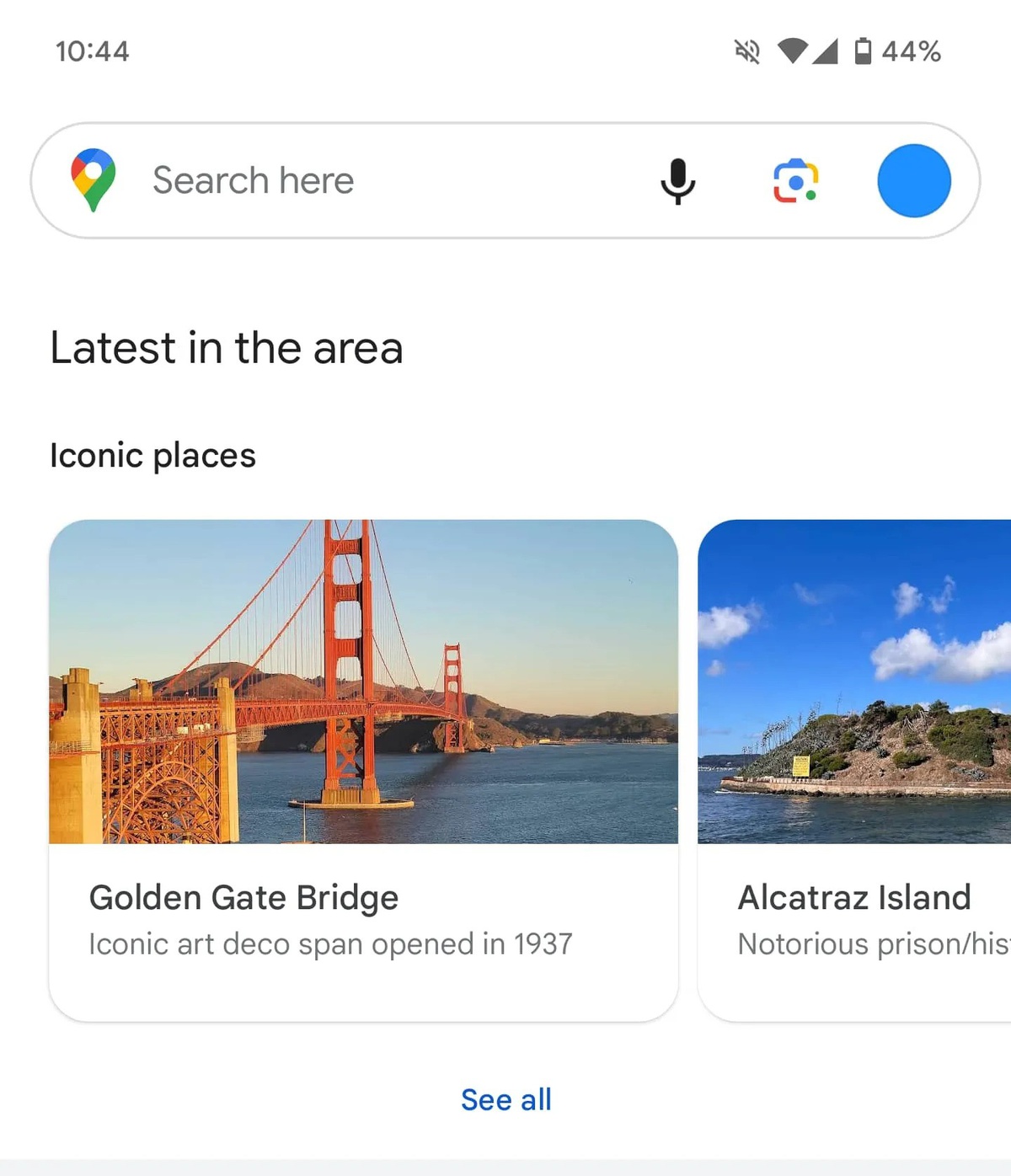

Previous vs. new design:
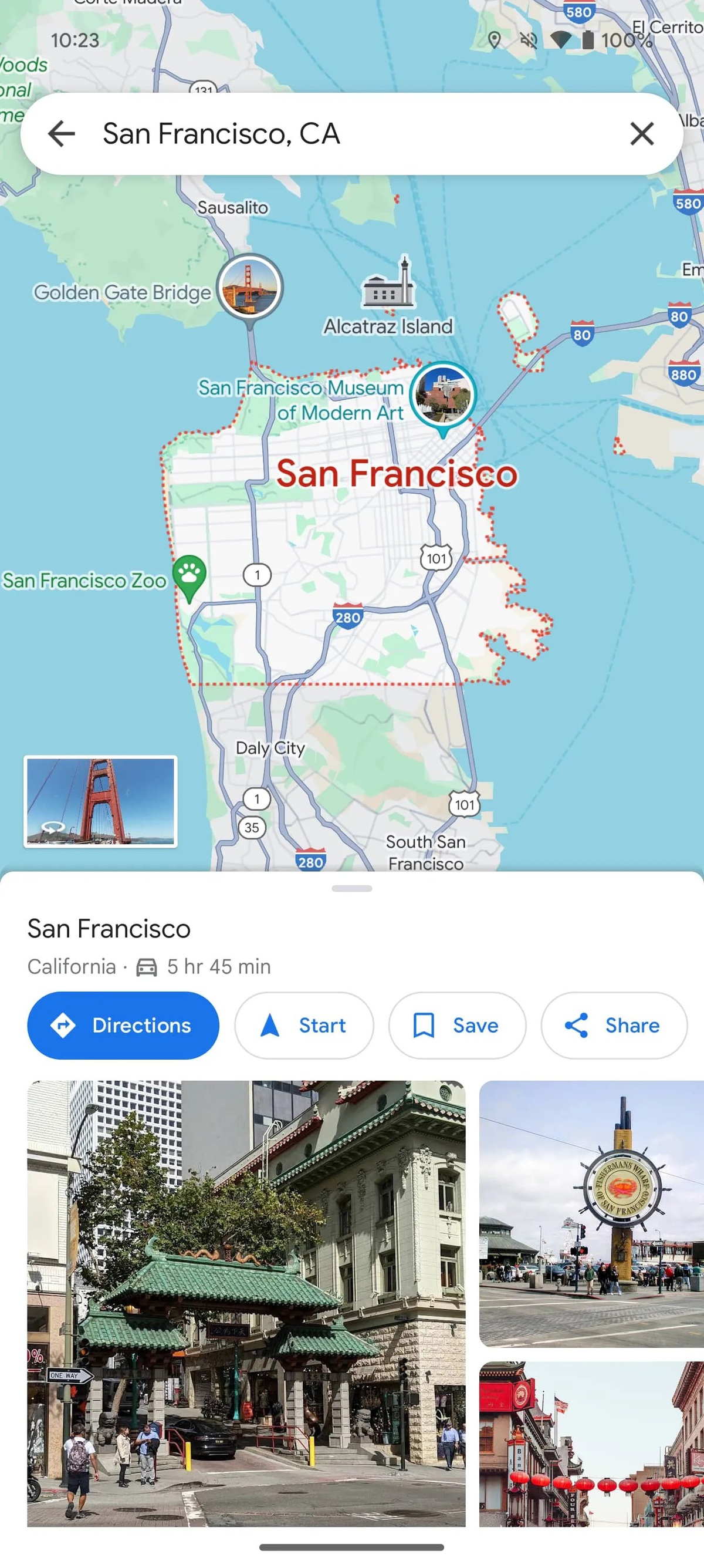

In another change, the layout now employs single-sheet designs instead of the previous double-layered style, allowing for cleaner visuals and more information displayed at once. Additionally, search options have been improved. Input fields for starting locations and destinations are positioned at the top and do not span edge-to-edge as before. Choices such as driving, public transit, walking, ride-hailing, and cycling have been relocated to the bottom of the screen to enhance usability.
Previous vs. new design:
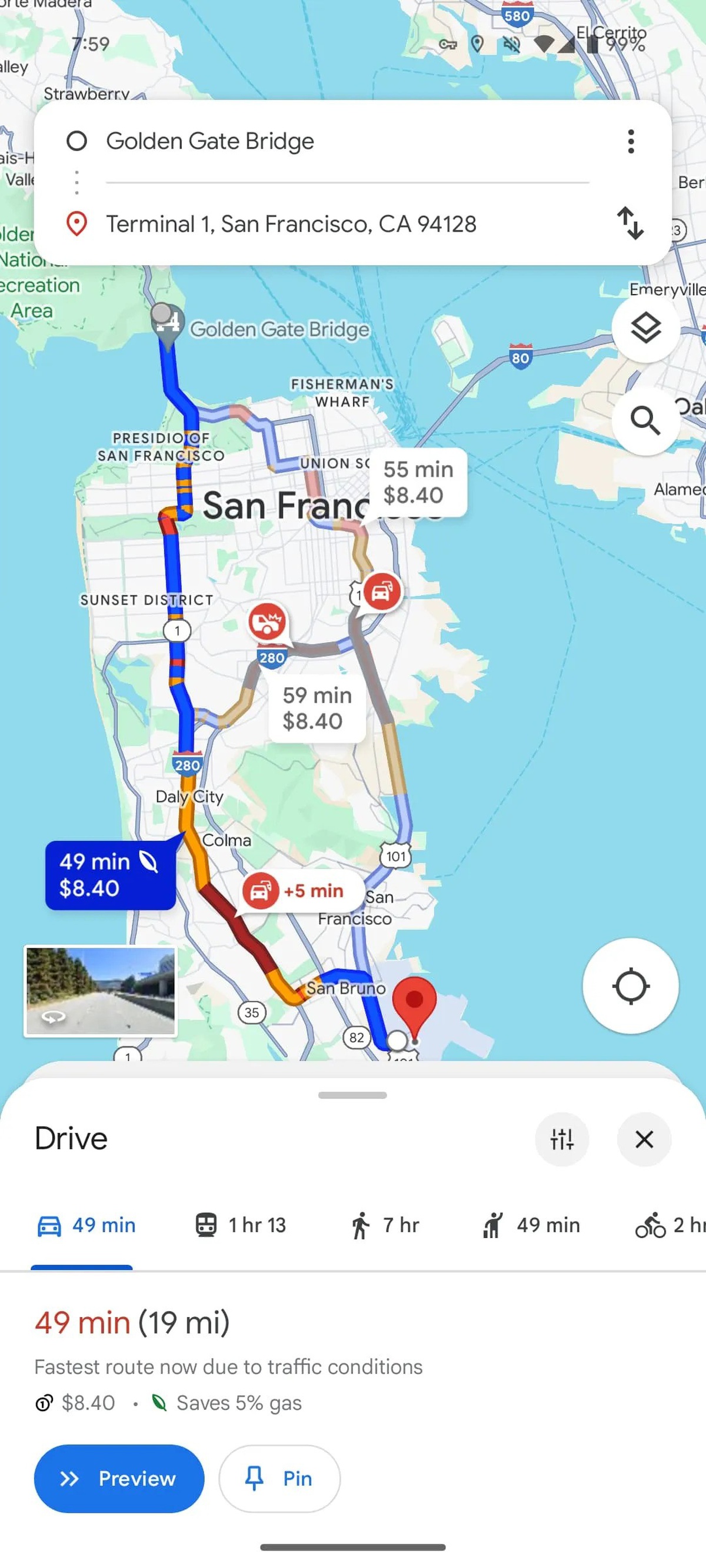
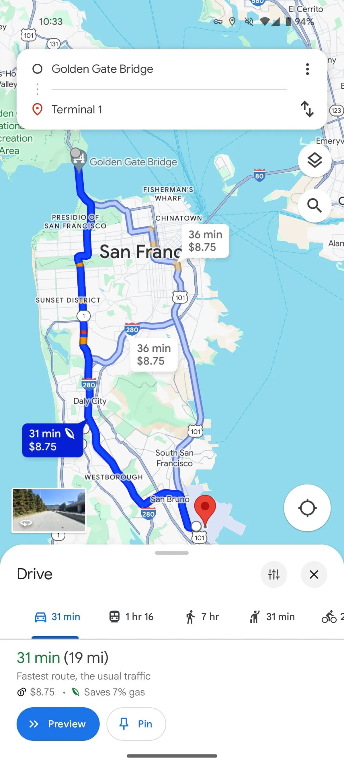
Previous vs. new design:
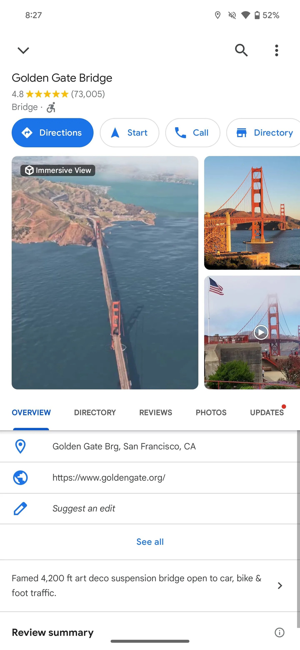
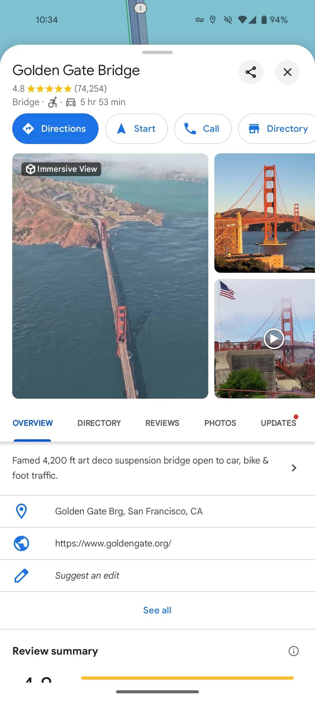
Previous vs. new design:
Currently on version 11.127.x, this redesigned Google Maps is still undergoing server-side tests on Android platforms and hasn't been widely rolled out as it's presently visible on only one account as observed today. This phased approach suggests that Google is taking user feedback into account to fine-tune the app's design and functionality before a full release.
Source: 9to5google

