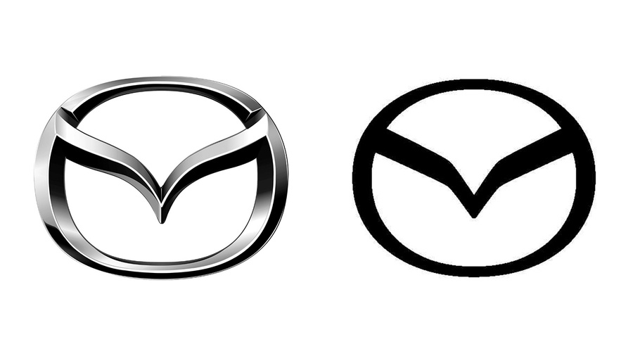
Every company seems to be doing it. Instead of logos with texture and personality, brands are flattening their designs for the modern age. Mazda might be the latest to follow this trend; a recent trademark filing in Japan reveals a streamlined, minimalist Mazda logo.
The new logo doesn't deviate much from Mazda's current one. It retains the same shape used since 1997, featuring a downward "M" at the center of a circular emblem.
Many competitors have also updated their logos in recent years. BMW, Audi, and Opel, among others, have flattened and simplified their designs. Given Mazda's move towards a more upscale image, this new look aligns with their strategy.


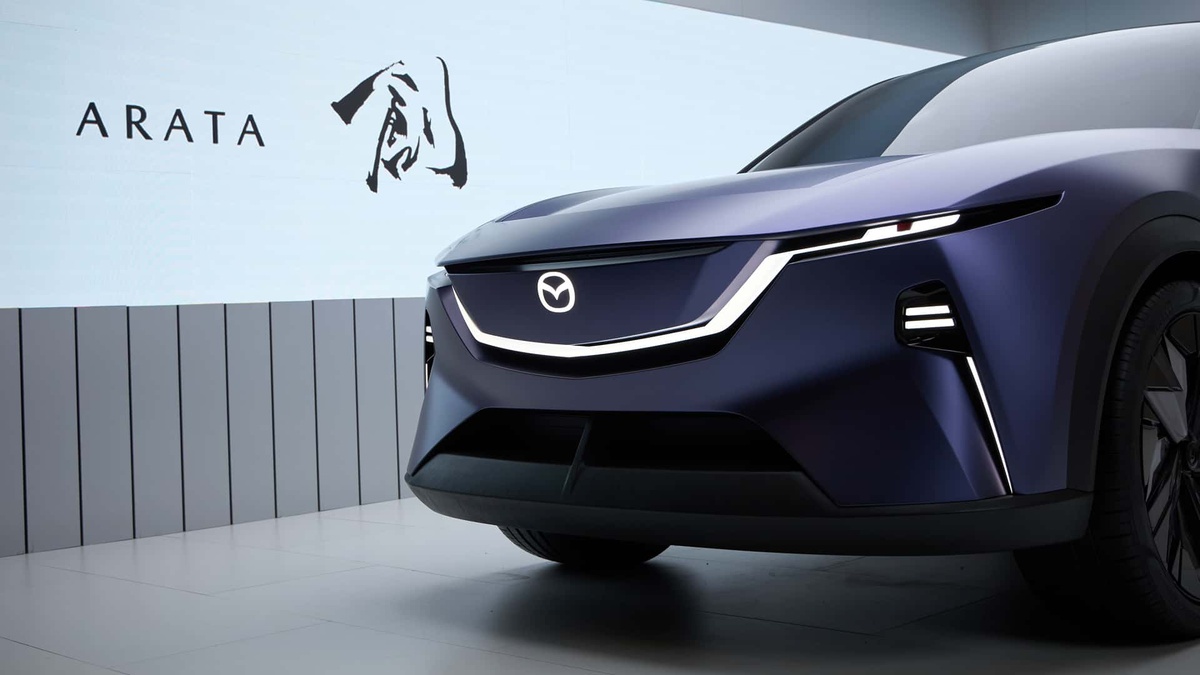
Mazda Arata concept
Another possibility is that Mazda will use this new logo predominantly for its EVs or its joint venture in China. A version of this simplified logo appeared on the Arata SUV concept car, which debuted at Auto China 2024 in Beijing with an illuminated logo on the front of the vehicle.
Source: Trademark Watch Japan
.jpg)

