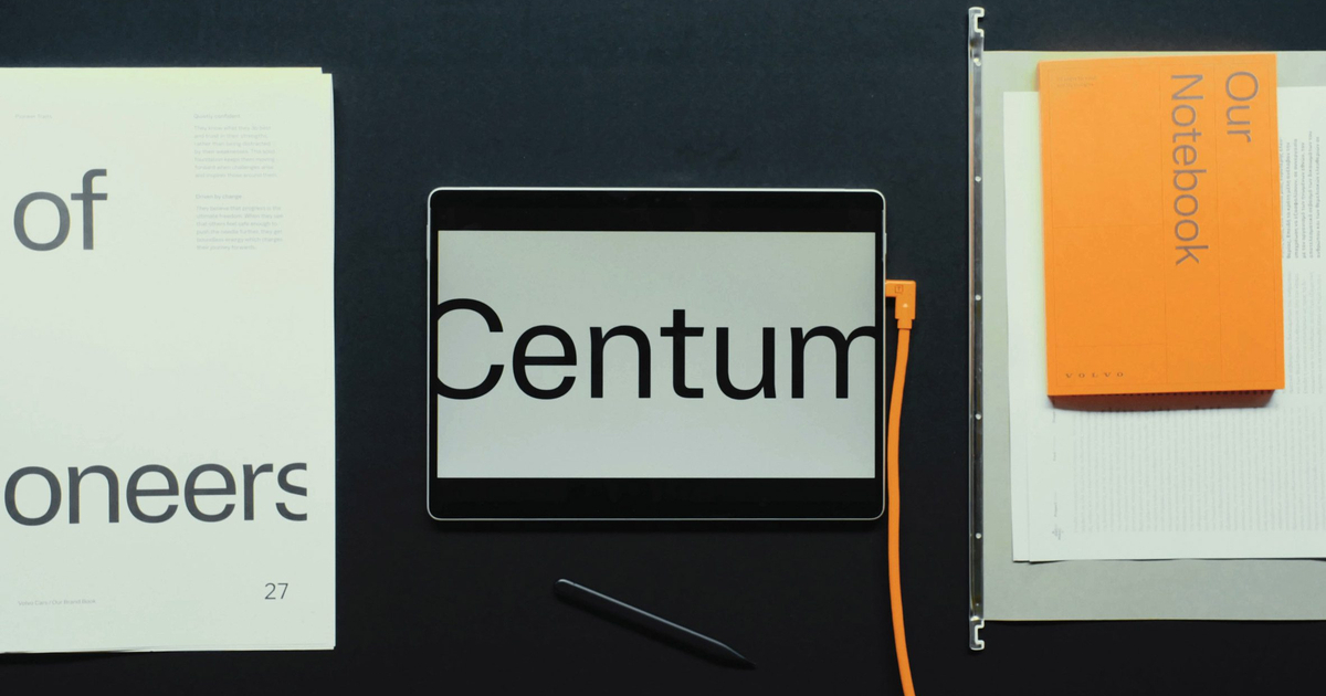
The font was created in collaboration with the type design studio Dalton Maag. Its main task is to convey information in such a way that the driver can read messages quickly and effortlessly, even at a glance and in difficult lighting conditions. Volvo emphasizes that the project is directly related to the safety philosophy, which has remained a key principle of the company for almost a hundred years.
According to Matthew Hall, Volvo Cars' creative director of UX, Volvo Centum was developed with a focus on clarity and intuitiveness. The font makes information perception easier, reduces visual noise, and helps the driver focus on the road rather than the screen.
In creating the font, the team took into account the features of visual perception and cognitive psychology. Attention was paid to symbol recognition, open letter spacing, and other typographic details that facilitate quick text scanning. Reducing cognitive load—how the brain distributes and processes information while driving—was worked on separately.


The impact of the font on eye movement, the so-called saccades, was also considered. Letter shapes, their combinations, size, and interface layout were selected so that the eye moved smoothly across the screen and allowed for recognizing more words at a glance. This directly affects reading speed and understanding of information.
The name Volvo Centum refers to the brand’s 100-year anniversary, which Volvo will celebrate in 2027. The font's debut is planned for early 2026—it will first appear in the new Volvo EX60 crossover.
In addition to functionality, the font provides a visual connection with the brand's history. Volvo notes that during the work on letterforms the designers were inspired by classic models, including the 1990s Volvo 850. In the outlines of the font, one can see references to the vertical taillights, the diagonal of the three-point seatbelt, and the signature sense of proportions characteristic of the brand's cars.
Source: Dezeen
