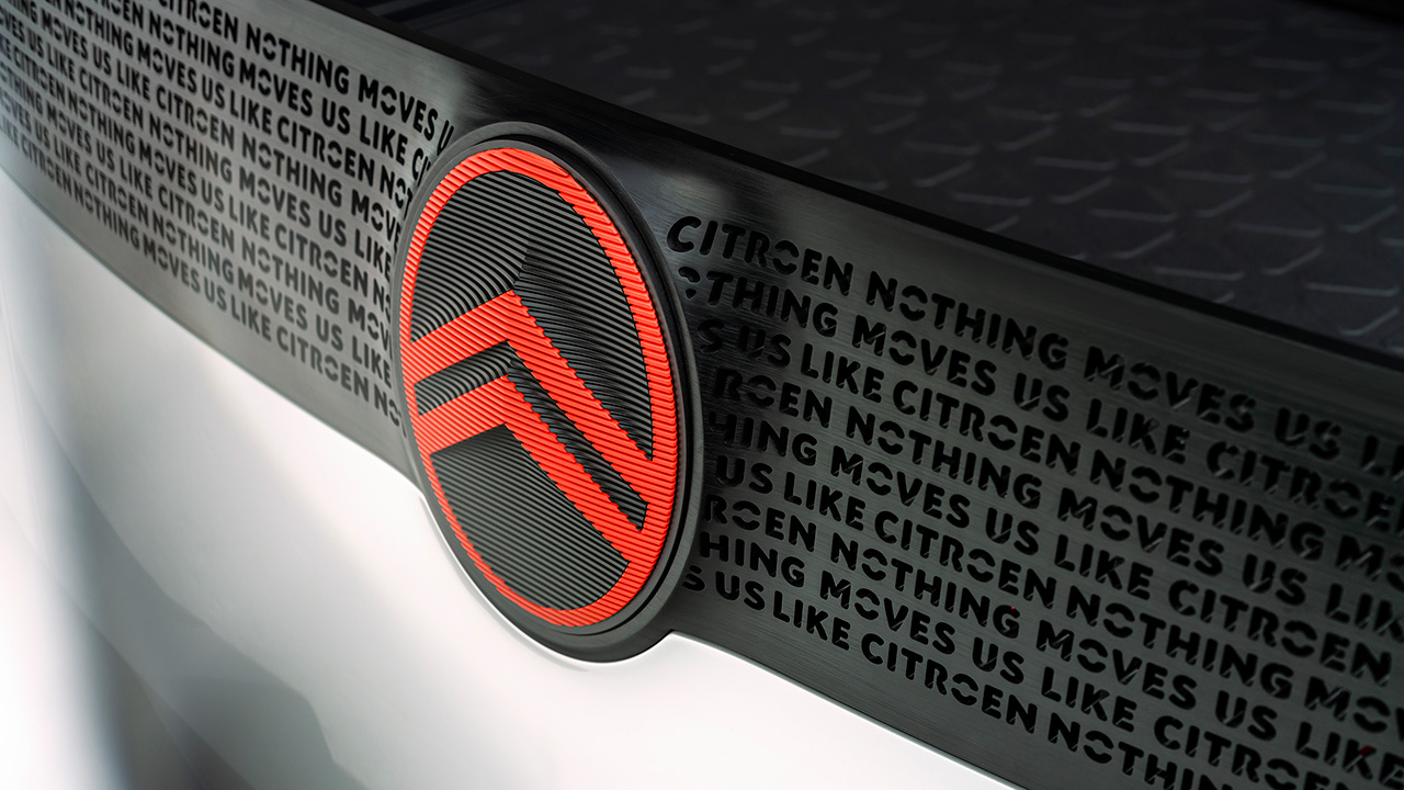
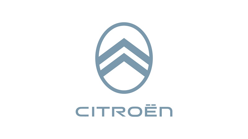
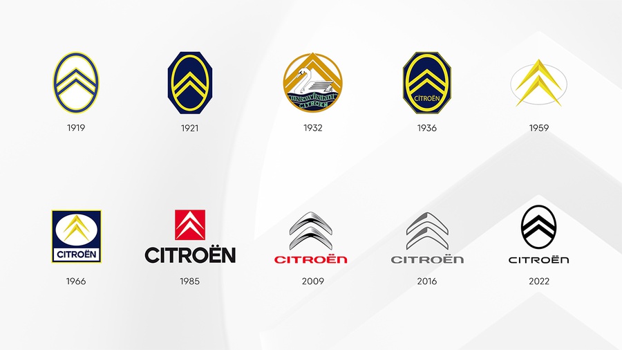
The central part of the new brand identity is the evolution of Citroën's world-famous "deux chevrons" symbol. The chevrons are now wider and more prominent, and they contrast against a softer vertical oval frame.
Significantly, the more prominent, enhanced vertical oval will initiate a new direction in product design language in which the visually prominent badge will become an immediately recognizable signature element of all Citroën models.
Citroën's Global Brand Designer Alexandre Revert says: "As we look to clarify our future focus, it was logical for us to close the loop by coming back graphically to André Citroën's first logo which represented the genuine promise of affordable and innovative mobility for all. Progressively moving to a more prominent and visible brand signature for our future designs is a significant if subtle evolution, where the precision of the technical, functional chevrons are embraced by and contrasted with the warmth and almost human softness of the oval that surrounds them."
Supporting the new vertical oval logo is a fresh corporate identity programme that acts as a further and timely indication of how Citroën is accelerating its commitment of making electric mobility accessible to all while maintaining and extending its core DNA for accessibility, audacity and customer wellbeing.
It includes a simplified user interface with support for "dark mode", new animations for the car electronics and My Citroën app, and an update of the corporate color palette. And also the new brand signature - "Nothing Moves Us Like Citroën" - will start to be used selectively in corporate and product communications and activities.
The first physical evidence of this will be explored in a conceptual family vehicle, which will carry the new identity and be revealed by Citroën at the end of September.
Source: Citroën
