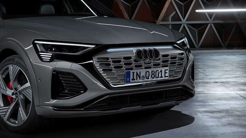
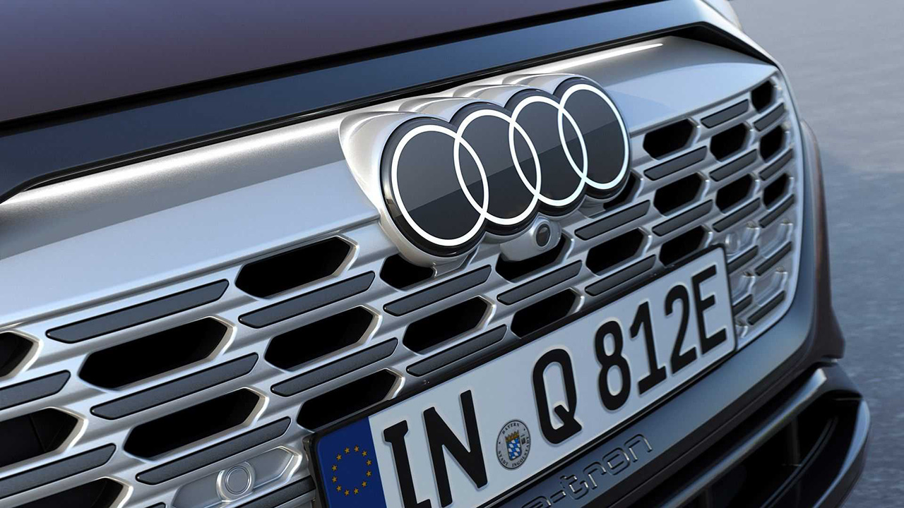
In recent years, many car companies have started using new two-dimensional designs for their logos and emblems. This keeps the branding consistent across different mediums, from computer screens to car grilles. Audi is the latest company to join this trend, introducing a new 2D badge for its vehicles.
Audi's four rings remain, but the company updated its logo to a flatter overall styling. According to Audi designer Andre Georgi, the new logo is "significantly more modern" than its predecessor. The idea for a 2D Audi logo originated in 2016; however, it didn't become popular until 2020 when the German automaker started to rethink its corporate identity and realized that it wanted the four rings to look identical irrespective of where they were displayed.


Audi's new logo
The company will still allow customers to get the new rings in black, but the primary colors will now be dark gray instead of white. Audi's new logo coincides with the automaker also standardizing the fonts used inside and out. It's called "Audi Type," which customers will begin seeing on the B-pillar of new Audi models and likely elsewhere throughout the vehicle.
Source: Audi

