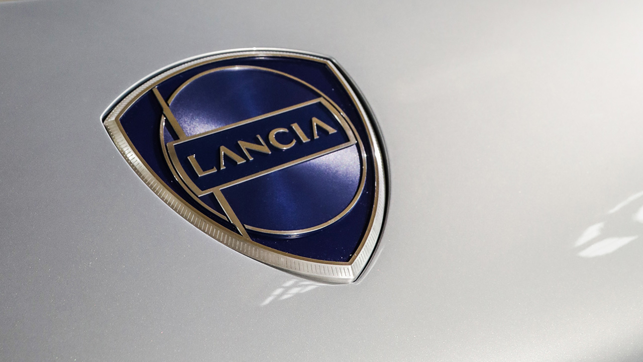
Mainly inspired by the 1957 logo, which was first introduced on the Lancia Flaminia, the new logo represents an authentic jewel, very classic in its aesthetics, where elements of simplicity and graphic purity meet elements of preciousness, in terms of colors, materials, and treatments. Made of aluminum and expression of the new graphic codes of the Brand, the new logo is "shrouded in light" and is the result of technologies used in the automotive industry, and not only, as demonstrated by the circular brushing typical of the watch dial.

The new Lancia logo revisits the distinctive elements of the historical logo, the wheel, the flag, the shield, the lance and the lettering, reinterpreted to make them modern. Also new is the Lancia lettering with an original font which takes inspiration from one of the Italian excellences most closely linked with the history of the brand, Fashion.
This new logo will be displayed on the new Ypsilon, on the new flagship, and on the new Delta. It is an integral of the new Corporate Identity that will involve the European dealerships, all renewed in terms of image by the beginning of 2024, and of all communication activities, both online and offline.
Source: Lancia
