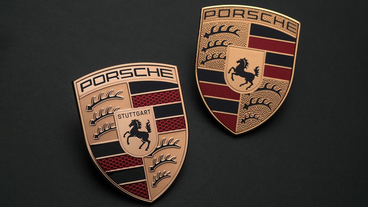
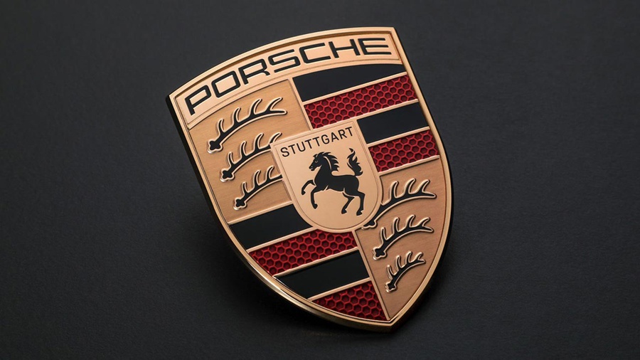
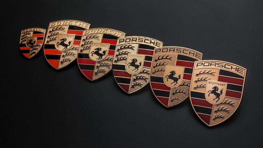
The previously bronze knurling on the crest has been completely smoothed out. This sleek background now showcases the prominent "PORSCHE" inscription across the top and "STUTTGART" (now in black) at the center of the emblem. The knurling behind the red striping has been replaced with a honeycomb pattern, reminiscent of a carbon-fiber weave.
This redesign is a significant milestone as Porsche celebrates 75 years of producing remarkable sports cars. The company has incorporated some version of the crest in its vehicles since its introduction in 1952. Over time, the trademarked logo has undergone five updates, with the most recent changes occurring in 2008.
Like many automotive brand logos, the Porsche crest pays homage to the brand's rich heritage and its place of origin. The galloping horse and the shape on which it is displayed derive directly from the seal of the city of Stuttgart. Similarly, the black and red colors, along with the antlers in opposing corners, are inspired by the German state of Württemberg-Hohenzollern (now Baden-Württemberg), proudly representing the home of this renowned German automaker.
“The Porsche crest is an unmistakable symbol and simultaneously a central element of our brand identity,” says Robert Ader, Chief Marketing Officer at Porsche AG. “For this reason, the modernised crest became the occasion for us to rework our brand design. We will be using the crest in a more targeted way to underline emotional highlights. At the same time, the Porsche lettering will take on even greater significance."
According to Porsche, the updated logo will start adorning vehicles towards the end of 2023.
Source: Porsche


