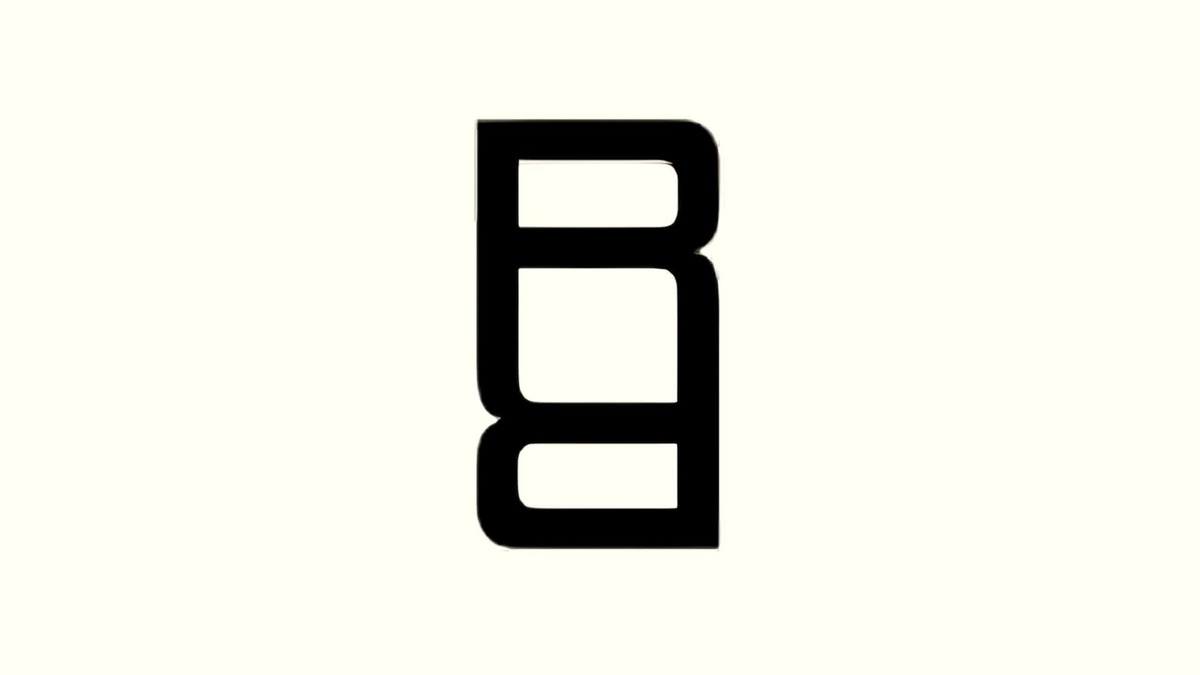
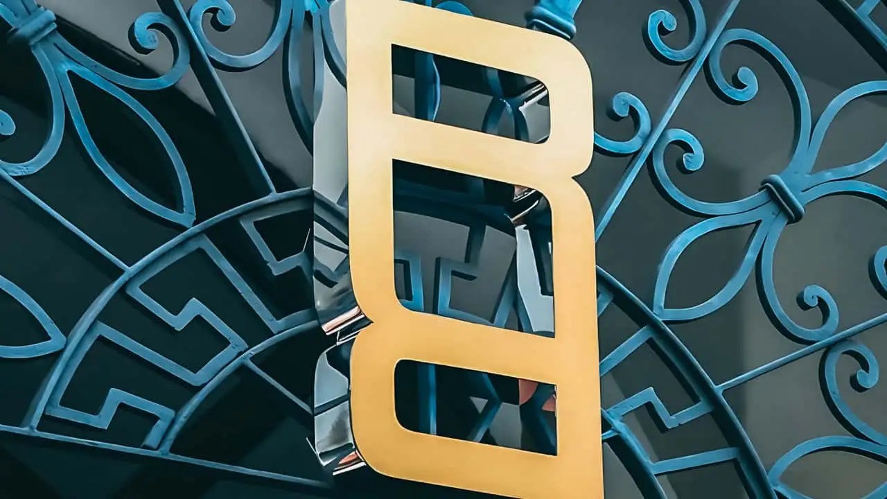
The new logo is designed in the shape of two "R" letters and uses a wide minimalist font characteristic of the brand.
The graphic element was presented in a presentation for investors. It will not replace the familiar Range Rover lettering, which remains on the hood and rear of all models. As the company explained, the logo will be used where the standard font is inappropriate, such as on labels, in repeating patterns, or at events.
The appearance of the logo is part of the "House of Brands" strategy, under which Range Rover, Defender, Discovery, and Jaguar are highlighted as separate sub-brands with their own marketing identity. Jaguar has already unveiled its new branding, while Defender and Discovery are still awaiting their turn.
At the same time, the name Land Rover is retained—it will now play the role of a "mark of trust" and denote platforms, technologies, and off-road capabilities of JLR models. The company’s CEO Adrian Mardell previously emphasized that the name Land Rover will not disappear and will remain on the vehicles, social media, websites, and with dealers.


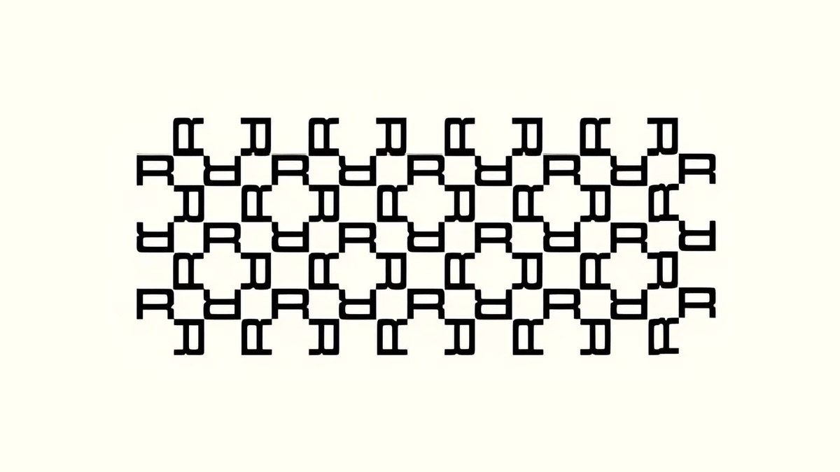
Range Rover logo and pattern
Along with the new logo, the Range Rover brand also introduced the "Range Rover pattern" - a checked design that incorporates the updated symbol. It is not yet clear where it will be used, but it can be assumed that this will be the design for grilles, interiors, or special editions, emphasizing the distancing of Range Rover from more utilitarian Land Rover models.
Source: Autocar

