In 1948, the founders of the company believed that simply spelling out 'Porsche' in clear, straightforward letters was all that was necessary. However, their customers held a different perspective. Dr. Ottomar Domnick, one of the original patrons of Porsche, initiated the Porsche Prize in search of a logo for the new brand. As early as 1951, Max Hoffman, the individual responsible for importing the cars to America, discussed with Ferry Porsche the idea of designing a logo. Unfortunately, none of the submitted designs gained traction.
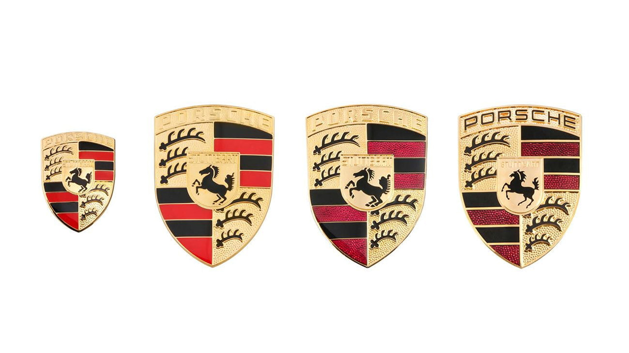
Ferry Porsche had initially conceived the notion of adorning the steering wheel with the Stuttgart crest. However, it wasn't until 1952 that a logo was finally created. The credit for the original design goes to Franz Reimspiess, a talented designer and engineer who was also responsible for creating the VW logo. Drawing inspiration from the Stuttgart coat of arms, the logo showcased a rearing horse within the contours of a golden shield. The red and black state colors, as well as the stylized antlers, were derived from the traditional crest of Württemberg-Hohenzollern.

This design not only embodied Porsche's commitment to manufacturing cars in Zuffenhausen but also served to unify the brand's origins. With the logo in place, the company possessed a distinct and memorable element that left an impression on its vehicles, as well as in advertisements and publications. However, it was not without its challenges and controversies.
During the 1950s, color printing proved to be an expensive and complex process. Not all printers had the capability to produce color images, let alone produce graphics with the desired sharpness. Moreover, when printed in black and white, the Porsche crest lost much of its visual appeal. Additionally, some individuals felt that the logo was too intricate, lacking a "compact, coherent visual effect."
Around the same time that the new Porsche 911 was being developed, there was a movement advocating for a logo change. However, according to Ghislain Kaes, a Porsche chronicler, internal company correspondence suggests that the decision-makers deemed a change unfavorable and opted to stick with the original logo.
As Porsche celebrates its 75th anniversary, showcasing exhibits and art cars, it is difficult to envision its vehicles adorned with any other crest than the original one. While many other automakers update their logos, Porsche's crest remains steadfast, serving as a constant reminder of its roots.
Source: Porsche
